top of page
Brand Strategy + Design

Time Warner
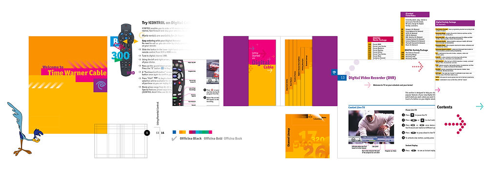
Time Warner Cable had no unified system of printed literature for their subscribers. Their literature was poorly designed and was difficult for subscribers to utilize.
An audit of previous materials was conducted to identify pain points. A comprehensive and flexible “kit” system of literature was conceived. The system consisted of six inserts and a manual. Color and typography became the driving visual language elements in re-designing all content in an information design friendly manner. The system was also economical as content was easily updated and distributed.
This model proved extremely successful and was implemented in other major markets across the U.S.
Information Design
Visual Language
bottom of page